blog»Conversion Rate Optimization»The Power of Precision: How Slack’s High-Quality Landing Pages Drive Success
The Power of Precision: How Slack’s High-Quality Landing Pages Drive Success
2024/03/11
You can read this article in about 20 minutes
Introduction
You know, in the digital age, first impressions are everything. That’s where high-quality landing pages come into play – they’re not just the front door to your digital world; they’re the friendly handshake, the warm welcome, the “Hey, let’s get to know each other” moment. And who better to learn from than the masters of communication themselves, Slack?
But before we dive into Slack’s secrets, let’s get something straight: a landing page isn’t just any webpage. It’s a crafted piece of marketing art designed to captivate, engage, and convert. Think of it as the Swiss Army knife in your marketing toolkit – versatile, indispensable, and incredibly effective when used right.
So, whether you’re a startup trying to make your mark or an established brand looking to shake things up, stick around. Because we’re about to unpack how Slack’s approach to landing pages can light up your path to conversion success. And don’t worry, we’ve got your back with some sharp insights and nifty tools from Ptengine to help you craft that ideal landing page. Let’s get started!
Section 1: Understanding High-Quality Landing Pages
Alright, let’s break it down – what exactly makes a landing page not just good, but great? Imagine your landing page as the ultimate party host. It’s not just about having a clean house (though design is definitely key). It’s about making guests (aka your visitors) feel understood, valued, and ready to stick around.
First up, clarity is king. A high-quality landing page communicates its message as clearly as the Caribbean Sea on a sunny day. It tells visitors, “Here’s what we do, and here’s what you can get.” No jargon, no beating around the bush – just straightforward, compelling content that resonates with your target audience.
Next, let’s talk design. This isn’t about being the next Picasso, but about creating a user-friendly experience. It means intuitive navigation, responsive layouts, and eye-catching images that serve a purpose – guiding visitors towards the action you want them to take. Color schemes, typography, and spacing all play a part in making your page as inviting as a warm cup of coffee on a cold morning.
Now, onto the core: content and user experience. Your headlines should be attention-grabbing, your bullet points concise, and your calls-to-action (CTAs) impossible to ignore. But beyond the words and buttons, the experience should be seamless. Whether it’s filling out a form or navigating through different sections, users should feel like they’re on a leisurely stroll, not a maze-running competition.
But why do all these elements matter so much? Because they’re the pillars that support your conversion goals. High-quality landing pages turn casual browsers into leads, and leads into customers. They’re the silent salespeople of your digital storefront, working 24/7 to convert and convince.
Remember, the goal here is to make your visitors think, “Yes, this is exactly what I need.” By mastering clarity, design, and user experience, your landing page can do just that. Stay tuned, because we’re going to see how Slack takes these elements and turns them into conversion gold.
Section 2: The Slack Approach to Landing Pages
When we dive into Slack’s strategy, it’s clear they understand the assignment: create landing pages that not just capture attention, but hold it, nurture it, and gently guide it towards a meaningful action. How do they do it? By mastering the blend of simplicity, clarity, and engagement.
Let’s start with simplicity. Slack’s landing pages are a testament to the power of minimalism. They strip away the unnecessary, focusing on what matters most. There’s no clutter, no overwhelming choices — just a clean, straightforward design that guides you naturally from point A to point B. The use of whitespace, combined with clear, legible fonts, makes their value proposition stand out, ensuring it’s the first thing that catches your eye.
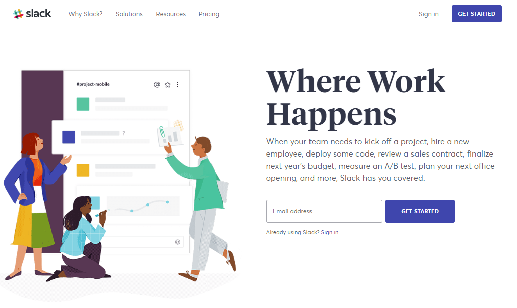
Clarity comes next. Slack knows that in the world of landing pages, confusion is the enemy of conversion. Their pages clearly define the product’s purpose, benefits, and the steps a visitor should take next. Whether it’s signing up for a free trial or scheduling a demo, the path is laid out with unmistakable clarity. This approach removes guesswork and makes the visitor’s journey as smooth as a well-oiled machine.
Engagement seals the deal. Slack’s landing pages aren’t just informative; they’re interactive. They use animations, videos, and real-life testimonials to breathe life into their pages. But it’s not just for show – each element is carefully chosen to add value, answer questions, and address potential objections. This interactive content keeps visitors engaged, reducing bounce rates and increasing the likelihood of conversion.
In essence, Slack’s landing pages are like a well-prepared sales pitch: concise, clear, and compelling. They make every visitor feel seen, understood, and one click away from finding the solution to their problems. Let’s break down these principles further and see how you can apply them to your own landing pages.
Section 3: Key Features of Slack’s Landing Pages
Slack’s landing pages are not just functional; they’re a masterclass in marketing psychology and design. Let’s dissect the key features that set them apart.
Firstly, personalization and targeting are at the heart of Slack’s strategy. They understand that different visitors have different needs. By segmenting their audience and creating landing pages tailored to each segment, Slack speaks directly to the individual concerns and interests of their users. Whether you’re a small business or a large enterprise, you’ll find a landing page that feels like it was made just for you.
Clarity and simplicity are the stars of the show. Slack’s landing pages use clean, straightforward layouts that remove any potential friction in the user’s journey. The main message and value proposition are crystal-clear, making it easy for visitors to understand what Slack offers and why it matters to them. This clarity is complemented by simplicity in design — no unnecessary information or distracting visuals, just what’s needed to guide users towards taking action.
The Call-to-Action (CTA) buttons on Slack’s landing pages deserve a spotlight of their own. They are boldly placed, impossible to miss, and worded in a way that encourages immediate action. But it’s not just about visibility; Slack’s CTAs are the culmination of the page’s content, promising a clear benefit that matches the user’s intent.
But Slack doesn’t stop at great design and content; they also ensure their landing pages are interactive and engaging. Through the use of video content, interactive demos, and real-time chat options, visitors are not just passive viewers but active participants. This interactivity keeps users engaged and encourages them to explore what Slack has to offer.
In conclusion, Slack’s landing pages excel because they blend targeted personalization with clear, concise messaging and interactive elements. They create a journey for the visitor that’s as informative as it is engaging. Let’s take these insights and look into how you can harness them to elevate your own landing pages.
Section 4: Lessons from Slack’s Landing Page Success
Slack’s approach to landing pages offers valuable lessons for any business aiming to enhance its digital presence and conversion rates. Let’s distill these learnings into actionable insights:
- Integration with Overall Marketing Strategy:
- Consistency is Key: Ensure your landing pages reflect the overall brand and messaging strategy to create a cohesive user experience.
- Aligned Objectives: Each landing page should serve a clear purpose that aligns with your broader marketing goals, whether it’s increasing sign-ups, promoting a new feature, or boosting engagement.
- Continuous Optimization:
- Embrace A/B Testing: Regularly test different elements of your landing pages (headlines, images, CTAs) to see what resonates best with your audience.
- Feedback Loop: Use analytics and user feedback to continuously refine and improve the landing page experience.
- User Engagement:
- Value-Driven Content: Provide content that is directly beneficial to the user, answering their questions and addressing their pain points.
- Interactive Elements: Incorporate features that promote user interaction and engagement, such as chatbots, quizzes, or video demos.
Key Takeaways:
- Ensure that your landing pages are an integral part of your overall marketing strategy, maintaining brand consistency and meeting specific business objectives.
- Adopt a culture of continuous improvement by testing and optimizing your landing pages based on real user data and feedback.
- Enhance engagement by providing clear, value-driven content and interactive experiences that meet your visitors’ needs and guide them towards taking action.
By adopting these strategies, you can create landing pages that not only capture attention but also convert visitors into loyal customers, following in the footsteps of Slack’s successful approach.
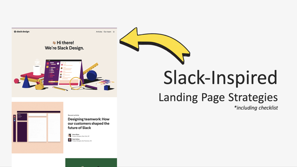
Section 5: Implementing Slack-Inspired Strategies in Your Landing Pages – Checklist
Enhance your landing pages with these Slack-inspired strategies:
Checklist
- Audience Tailoring:
Segment your target audience based on their needs and preferences.
Customize content and messaging to speak directly to each segment. - Design for Clarity and Conversion:
Employ a clean, uncluttered design focusing on key elements.
Highlight the benefits and value of your product or service. - Compelling Calls-to-Action:
Use clear, action-oriented language for your CTAs.
Ensure CTAs are visually distinct and strategically placed. - Continuous Optimization and Testing:
Implement analytics tools, like Ptengine, to track user interactions.
Regularly conduct A/B tests to refine headlines, images, and CTAs. - Engagement Through Interactivity:
Incorporate interactive elements such as quizzes, calculators, or chatbots.
Add multimedia like videos or interactive demos to showcase your product.
Key Actions:
- Personalize landing pages to fit the specific needs of different audience segments.
- Ensure design and content prioritize clarity and drive users toward conversion.
- Create CTAs that are easy to identify and compel users to take action.
- Use analytics and testing to continually improve the landing page experience.
- Engage users with interactive elements that provide value and enhance understanding.
Check off each item as you implement these strategies to ensure your landing pages are optimized for maximum engagement and conversion.
Conclusion: Transform Your Landing Pages with Slack-Inspired Strategies
Let’s wrap up, it’s clear that Slack’s approach to landing pages isn’t just about design; it’s about creating a journey for the visitor that’s both enlightening and engaging. By focusing on clarity, personalization, and interactivity, Slack transforms casual browsers into engaged users and, ultimately, into loyal customers.
Your landing pages hold the power to not just capture attention, but to convert that attention into action. Remember, every element from the headline to the call-to-action should serve a purpose and guide your visitor towards a decision. By applying the strategies we’ve outlined, from personalized content to continuous testing, you can elevate your pages from good to great.
But don’t stop there. The world of digital marketing is always evolving, and so should your landing pages. Use tools like Ptengine to dive deep into user behavior, and let data drive your design decisions. Be bold in your experimentation and steadfast in your pursuit of clarity and simplicity.
Now, armed with these insights, it’s your turn to step up and revamp your landing pages. Implement these Slack-inspired strategies, and watch as your pages transform into conversion powerhouses. Here’s to your success – one click, one conversion, one customer at a time.