blog»Conversion Rate Optimization»Optimizing Conversion: A Practical Application of Ptengine
Optimizing Conversion: A Practical Application of Ptengine
2024/04/17
You can read this article in about 8 minutes
Introduction
Welcome to our comprehensive how-to guide, designed to empower marketers with the tools and strategies needed to effectively use Ptengine. This guide is born out of a common challenge: many first-time users struggle to navigate through the rich functionalities of Ptengine, unsure of how to start unlocking its full potential to enhance website performance.
In this guide, we’ll walk you through a detailed, step-by-step process that illustrates how to identify and resolve common issues that could be impacting your website’s conversion rates. We begin with the basics of setting up and navigating Ptengine, emphasizing how to use its analytics dashboard and heat mapping features. These tools are invaluable for visualizing user behavior and pinpointing areas of your site that may not be performing as expected.
By following this practical journey, you will learn how to conduct an effective analysis of drop-offs in user sign-ups and how mismatches in page design can lead to decreased user engagement. We will also guide you through the process of setting up an A/B test to experiment with solutions, demonstrating how realigning the design of your sign-up and landing pages can lead to measurable improvements.
Armed with Ptengine and this guide, you’ll be equipped to not just understand but also apply key insights to make data-driven decisions that boost your site’s effectiveness and user experience.
Step 1: Analyze data
In the competitive world of online sales, “GentePin” (an anagram for Ptengine), a tech-forward SAAS company, faced a puzzling challenge: their sign-up rates were unexpectedly declining. To understand and address this issue, they turned to Ptengine, a complete marketing & analytics solution.
The team started by analyzing their website data through Ptengine. The initial discovery was stark—a significant drop-off in sign-ups was immediately apparent.
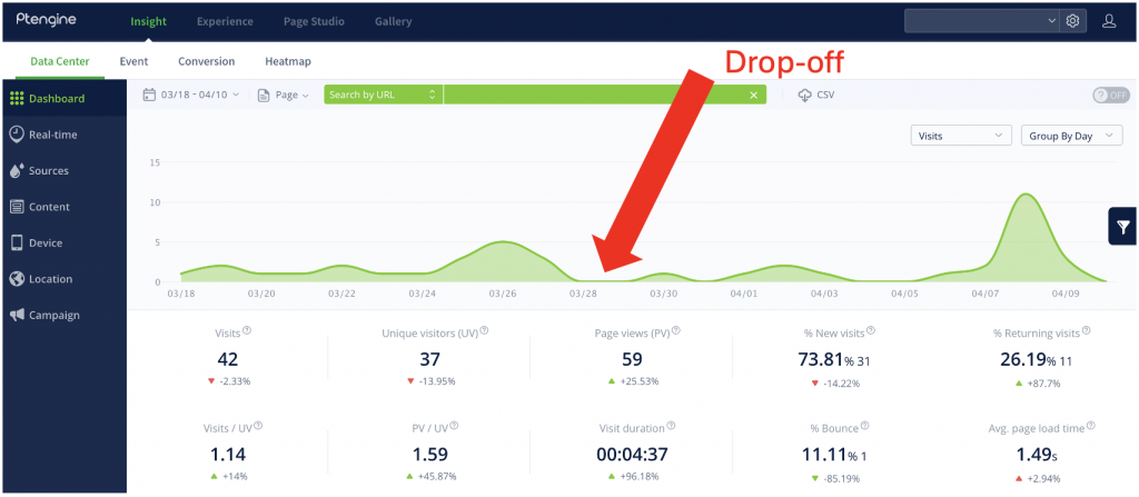
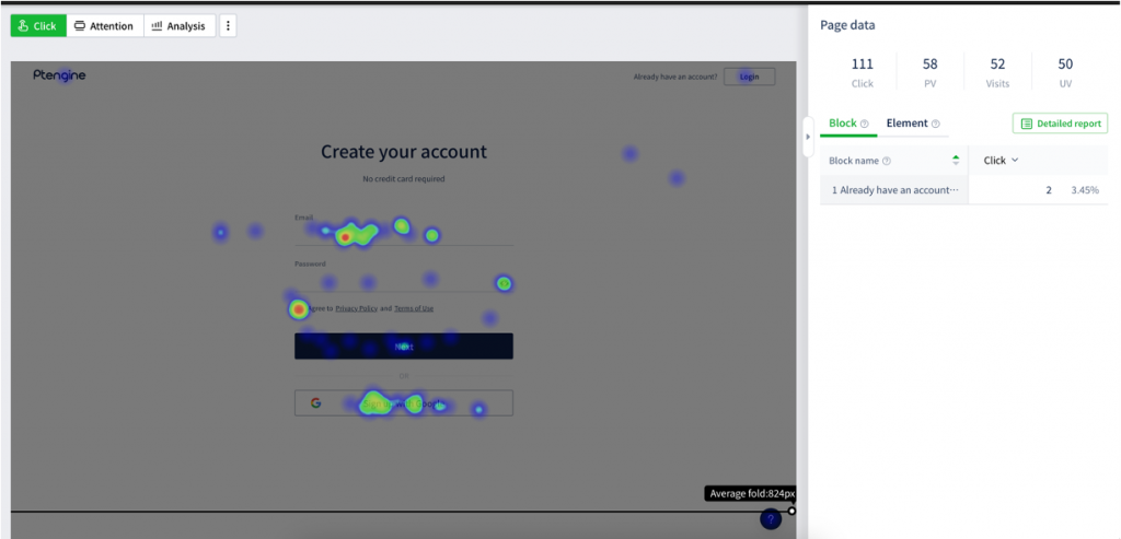
To visualize where potential customers were disengaging, they utilized Ptengine’s heatmap functionality. The heatmaps revealed that user engagement on the signup page was notably low compared to the landing page.
Step 2: Dig into the current User Experience
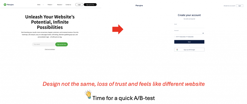
Further investigation showed a clear discrepancy: the design of the signup page was inconsistent with the landing page. This inconsistency likely confused or deterred potential customers.
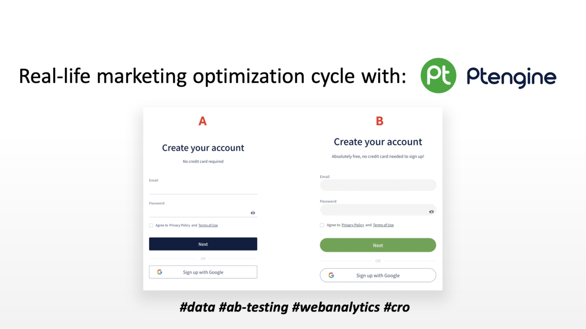
Step 3: Create a hypothesis and A/B-Test
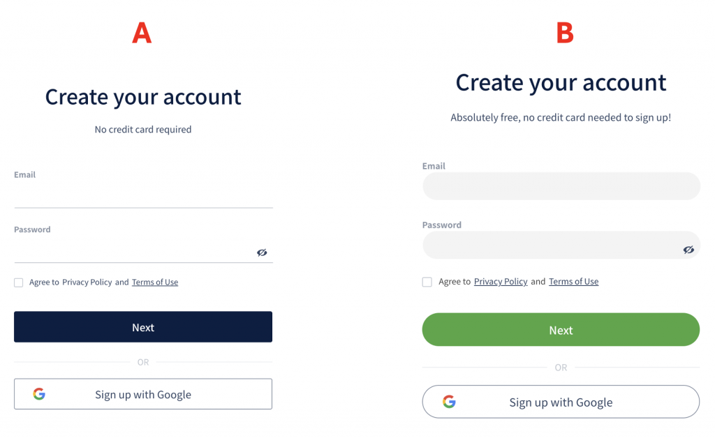
With this insight, the GentePin team decided to run an A/B test to resolve the design misalignment.
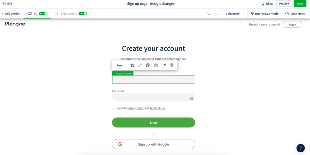
They created two versions of the signup page: the original and a new version that matched the landing page’s design aesthetics.
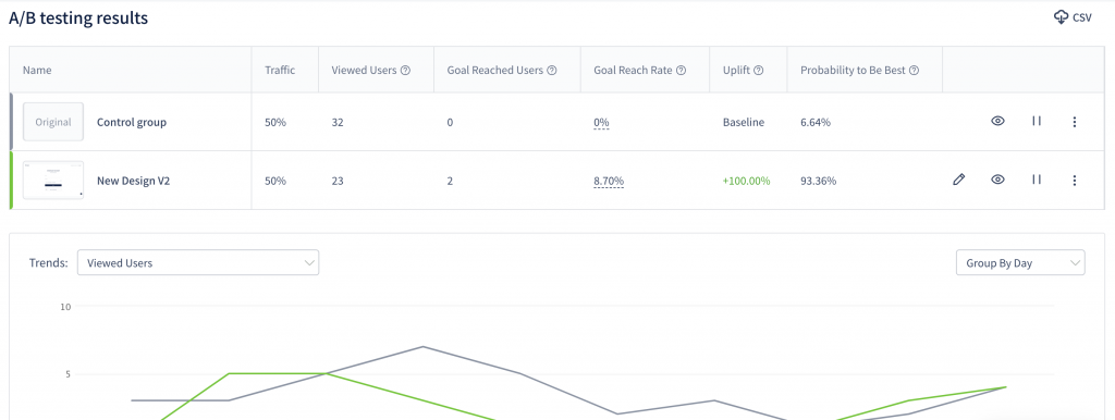
Step 4: Collect data
As the A/B-test ran, Ptengine collected and analyzed user interactions. The results were conclusive—the redesigned signup page significantly outperformed the original, leading to a noticeable increase in sign-ups. The test not only confirmed the hypothesis about design consistency but also highlighted the importance of unified visual communication in user experience.
Encouraged by these results, the team continued to leverage Ptengine for ongoing optimization, applying insights gained from analytics to refine and enhance other areas of their website.
Step 5: Go the Extra Mile
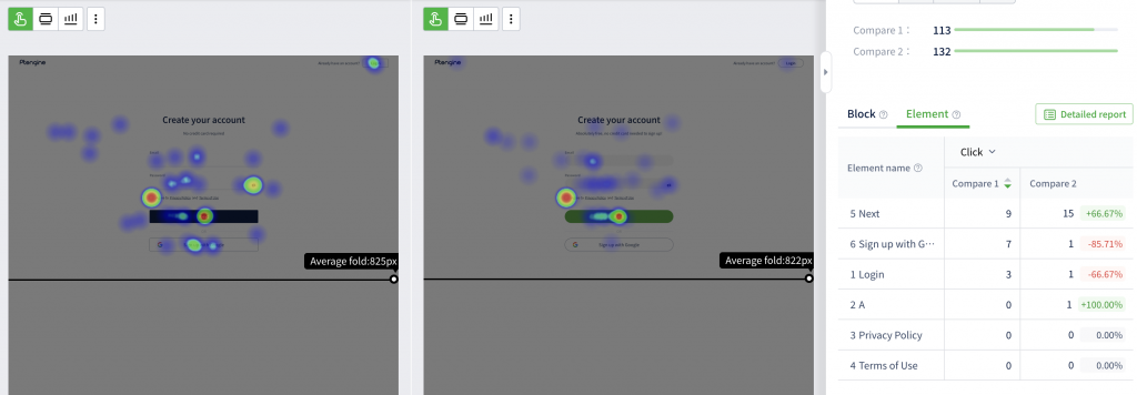
After observing the initial results of their A/B testing—which already highlighted the superior performance of the new, unified design—they decided to deepen their understanding of user interactions by overlaying heatmap data on top of the A/B-test results. This innovative approach allowed them to see not just which design performed better, but exactly how users interacted with different elements of each design. By comparing the heatmaps of the two versions, GentePin could pinpoint specific areas where users showed increased engagement or where they hesitated, providing even more nuanced UX insights. This dual-layered analysis method proved invaluable, offering a granular view of user behavior that informed further optimization efforts, ultimately enhancing the overall effectiveness of their website’s design.
Conclusion
In conclusion, GentePin’s strategic use of Ptengine’s analytics and heat mapping tools demonstrates a powerful approach to understanding and enhancing user engagement. By integrating standard A/B testing with the advanced analysis of heatmaps, GentePin not only optimized their website design but also gained deeper insights into user behavior. This case study exemplifies how leveraging the right digital tools can transform data into actionable knowledge, leading to improved business outcomes. If you are inspired to embark on a similar journey to elevate your online presence, try Ptengine or get in touch with us. We are here to help you understand your website better and improve both the user experience and conversion rates.