blog»Mobile Marketing»Smartphone Shopping Simplified: Revolutionizing E-Commerce through Mobile Optimization
Smartphone Shopping Simplified: Revolutionizing E-Commerce through Mobile Optimization
2024/02/04
You can read this article in about 41 minutes
Introduction
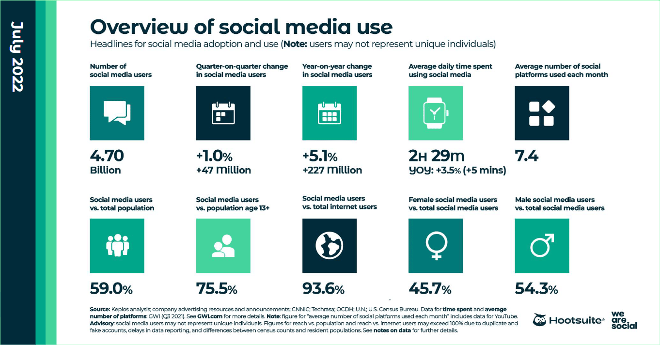
In the ever-evolving landscape of e-commerce, the saying ‘go where the customers are’ has never been more relevant. Today, that place is unequivocally in the palm of their hands – their smartphones. With the surge of mobile internet usage, shopping has comfortably nestled itself into our daily phone scrolls and taps. Recent statistics paint a clear picture: a skyrocketing number of consumers are turning to their mobile devices for shopping, whether it’s for browsing, comparing prices, or making actual purchases.
This shift isn’t just a passing trend; it’s a paradigm change in the way we think about e-commerce. Traditional desktop-based strategies are no longer sufficient. Businesses must now pivot and embrace a mobile-first approach, ensuring their online presence isn’t just visible on mobile devices, but optimized for them. The goal? To provide a seamless, engaging, and hassle-free shopping experience that fits into the customer’s pocket.

In this article, we’ll dive into the strategies that make e-commerce on smartphones not just viable, but advantageous. From the nuances of responsive web design to the intricacies of mobile UX and payment solutions, we’ll explore how optimizing for mobile is not just adapting to a trend – it’s future-proofing your business. Welcome to ‘Maximizing Mobile: Strategies for Optimizing E-Commerce on Smartphones’ – your guide to thriving in the digital marketplace of today and tomorrow.
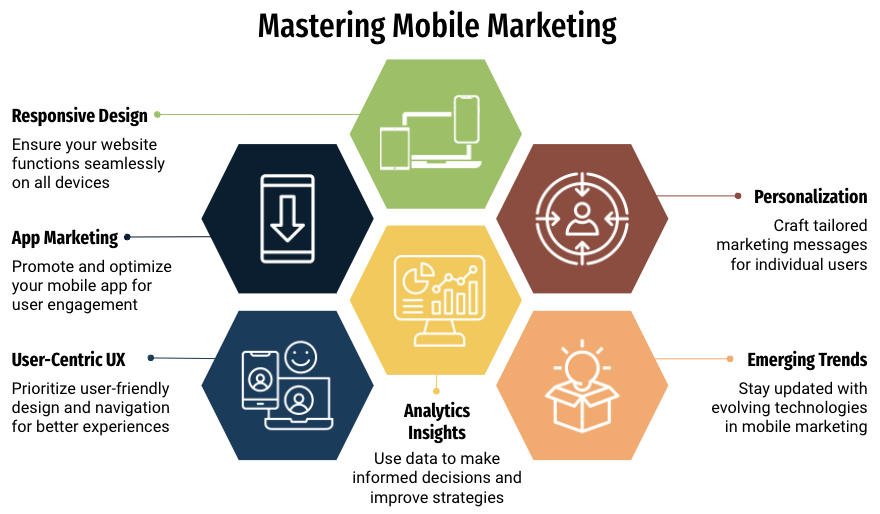
The Mobile-First Approach
In the realm of e-commerce, adopting a mobile-first approach isn’t just a savvy strategy; it’s an essential step towards staying relevant in a digital world that’s increasingly centered around smartphones. This approach involves designing an online store with mobile users as the primary audience, rather than as an afterthought following the desktop design. But why the shift in focus? The answer lies in the growing statistics: a significant chunk of internet traffic now comes from mobile devices, and more importantly, a considerable portion of online purchases are made through them.
When we talk about mobile-first, we’re talking about more than just making a website accessible on a smartphone. It’s about reimagining the shopping experience from the ground up for smaller screens. This involves prioritizing content, streamlining navigation, and ensuring that key actions like searching for products and completing purchases are as simple as tapping a screen.
Imagine an online store where the journey from discovery to purchase is not just a scaled-down version of a desktop site, but a uniquely mobile experience. It’s about creating an environment where images load swiftly, text is easy to read without zooming, and buttons are sized for easy clicking with a thumb. The mobile-first design also means thoughtfully incorporating features like touch gestures and location services, enhancing the user’s interaction with the site.
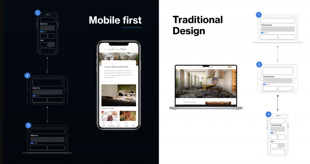
In essence, the mobile-first approach is about embracing the constraints and capabilities of mobile devices to deliver an e-commerce experience that feels natural, intuitive, and, most importantly, designed for the user on the go. By prioritizing mobile users, businesses are not just adapting to current trends; they’re setting themselves up for future success in a world where the smartphone is the gateway to the consumer’s heart and wallet.
Responsive Web Design
Responsive web design is the cornerstone of a successful mobile-first strategy in e-commerce. It’s the art and science of creating websites that provide an optimal viewing and interaction experience across a wide range of devices, from desktops to smartphones. The crux of responsive design lies in its flexibility – the ability of a website to adapt its layout and content to fit the screen size and resolution of any device.
Why is this so crucial for e-commerce? The answer is simple: a one-size-fits-all approach doesn’t work in the diverse world of internet devices. Users expect a seamless shopping experience whether they’re browsing on a 27-inch monitor, a tablet, or a 5-inch smartphone screen. Responsive design meets this expectation by ensuring that e-commerce sites are visually appealing and functional on any device.

In practice, responsive web design employs fluid grids, where elements of the webpage resize in relation to each other. This adaptability extends to images and text, ensuring they scale appropriately to provide a user-friendly experience. Additionally, responsive sites often utilize media queries from CSS3, allowing the content to respond to different conditions, such as screen resolution.
For e-commerce, this adaptability means customers can enjoy a consistent and enjoyable shopping experience, whether they’re at home or on the move. It eliminates common frustrations like tiny text, unclickable links, and endless scrolling, which can quickly turn potential customers away. By investing in responsive web design, e-commerce businesses are ensuring that their site is not just accessible, but appealing and effective, regardless of how it’s being viewed. This approach doesn’t just capture more customers; it lays the foundation for customer satisfaction and loyalty.
Mobile User Experience (UX) Optimization with Ptengine
Optimizing User Experience (UX) for mobile e-commerce is not just a design consideration; it’s a strategic imperative. In this compact digital space, every detail counts, and tools like Ptengine play a pivotal role in refining and perfecting the mobile shopping experience. The right UX can transform a user’s journey from browsing to purchase into a seamless, intuitive process, significantly impacting customer satisfaction and conversion rates.
Simplicity is the cornerstone of effective mobile UX design. A cluttered interface is a major deterrent on small screens. The goal is to present a clean, straightforward layout, focusing on core elements like clear product images, concise descriptions, and a navigation menu that’s easy to use with just a thumb. Ptengine’s heatmap feature is incredibly useful here, providing insights into how users interact with your page elements, helping identify areas that draw attention and those that are overlooked.
Navigation efficiency is crucial. Mobile shoppers, often on the go, value quick and easy access to what they’re searching for. Incorporating a prominent search bar, distinct category labels, and intuitive navigation menus enhances user engagement. Ptengine’s A/B testing capabilities allow for experimenting with different layouts and navigation structures to determine what works best for your audience.

The checkout process on mobile must be as streamlined as possible. Implementing features like auto-fill, a variety of mobile payment options, and a clear progress indicator enhances the checkout experience. With Ptengine, you can run A/B tests to fine-tune this process, ensuring a smooth and quick checkout that minimizes cart abandonment.
Furthermore, optimizing for touch is vital. Design considerations should include large, tapable buttons and appropriately spaced touch targets to prevent accidental presses. This is where Ptengine’s analytics can guide design choices, ensuring that the mobile site is not only accessible but also intuitive for touch interactions.
Incorporating tools like Ptengine in optimizing mobile UX is about leveraging data and testing to create an experience that feels natural and effortless for the mobile user. It’s about understanding the unique browsing and shopping behaviors on mobile devices and using this knowledge to tailor an e-commerce environment that not only attracts but also retains customers.
Speed Optimization for Mobile E-Commerce
In the fast-paced world of mobile e-commerce, speed isn’t just a feature; it’s a necessity. Mobile users are known for their short attention spans and high expectations for quick, responsive web experiences. Slow-loading pages are one of the top reasons for high bounce rates and lost sales in mobile e-commerce. Thus, optimizing the speed of your mobile site is crucial in retaining customer interest and maximizing conversions.
The first step in speed optimization is to assess your current performance. Tools like Google’s PageSpeed Insights provide valuable insights into how your site performs on mobile devices and offer specific recommendations for improvement. Compressing images, leveraging browser caching, and minimizing the use of heavy scripts and animations can significantly reduce load times.
Responsive design plays a pivotal role in speed optimization. A mobile-optimized site that scales content and images correctly for smaller screens loads faster and provides a better user experience. It’s not just about shrinking content to fit a mobile screen; it’s about reorganizing and optimizing it for mobile consumption.
Another key aspect is the optimization of server performance. Choosing the right hosting solution that offers fast server response times and scalability options to handle traffic spikes is essential for maintaining a quick and reliable mobile site.
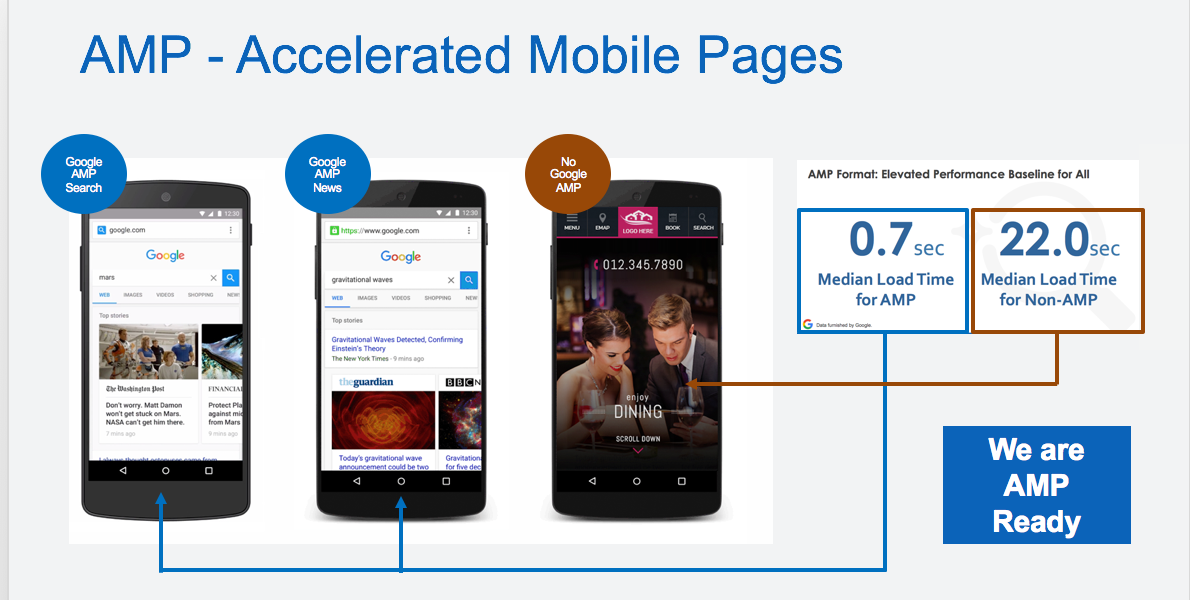
Moreover, implementing Accelerated Mobile Pages (AMP) can be a game-changer. AMP is a Google-backed project designed to speed up the loading of web pages on mobile devices. By creating lightweight versions of web pages that load almost instantly, AMP can dramatically improve the mobile browsing experience.
In conclusion, speed is more than a technical concern; it’s a user experience and marketing issue. A fast-loading mobile e-commerce site not only satisfies customers but also positively impacts search engine rankings, making it an indispensable component of your online success.
Mobile Payment Solutions for Enhanced E-Commerce Experience
The rise of mobile e-commerce brings with it the need for seamless, secure, and diverse mobile payment solutions. In today’s digital age, the checkout process is not just a transaction; it’s a crucial touchpoint in the customer’s journey. The convenience and efficiency of mobile payments can significantly influence the purchasing decision and overall satisfaction of the customer.
A key aspect of optimizing mobile payment solutions is offering a variety of options. This includes traditional methods like credit and debit cards, as well as digital wallets like Apple Pay, Google Pay, and PayPal. Each customer has their preferred method of payment, and providing multiple options ensures that the checkout process is inclusive and user-friendly.
Security is paramount in mobile transactions. Ensuring that your e-commerce platform employs the latest in encryption and security protocols builds trust and credibility with your customers. Features like two-factor authentication and SSL certificates are not just about protecting transactions; they’re about safeguarding your customer’s peace of mind.
Simplicity and speed are also crucial. The payment process should be as streamlined as possible, with minimal steps and quick loading times. Remember, every additional step in the checkout process is an opportunity for the customer to abandon their cart. Tools like one-tap checkout and the ability to save payment information for future purchases can greatly enhance the mobile shopping experience.
Moreover, integrating the payment system into the mobile shopping app or website ensures a seamless transition from browsing to purchasing. This integration not only simplifies the process but also keeps the user engaged within your ecosystem.
In summary, a well-optimized mobile payment solution is a blend of security, diversity, simplicity, and speed. It’s about creating a checkout experience that aligns with the convenience and immediacy that mobile shoppers expect. This chapter is crucial for businesses looking to capitalize on the booming mobile e-commerce market by providing an efficient, secure, and enjoyable payment experience.
Mobile Apps vs. Mobile Websites in E-Commerce
The debate between mobile apps and mobile websites is a pivotal one in the e-commerce domain. Each has its own set of advantages and drawbacks, and understanding these can help businesses make informed decisions about their mobile strategy.
Mobile apps offer a more personalized, faster, and often more interactive shopping experience. They can leverage device capabilities like push notifications, camera functions, and GPS, enhancing customer engagement and personalization. Apps also facilitate easier re-engagement with customers, as they remain on the user’s device after the initial download, encouraging repeat visits and potentially increasing customer loyalty.
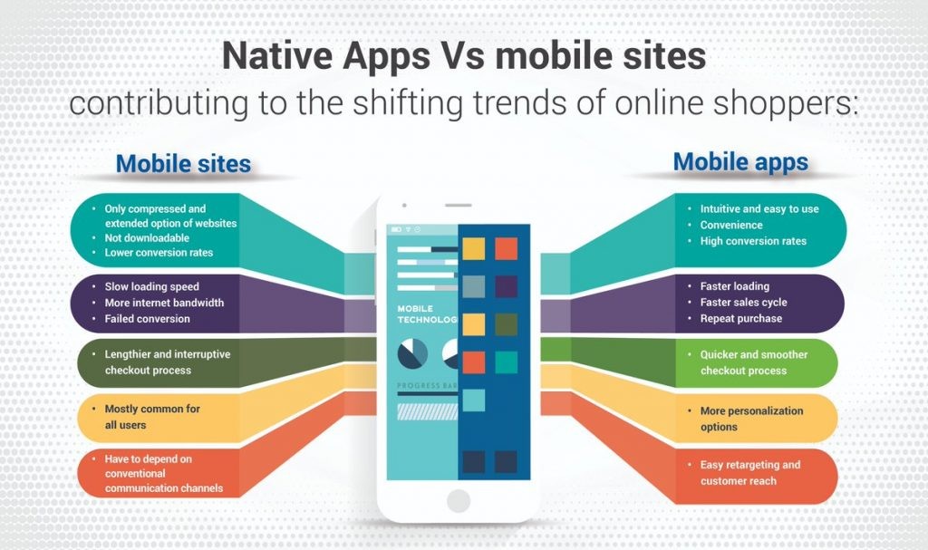
However, developing a mobile app can be costly and time-consuming, and it requires users to download and install it. This can be a significant barrier, especially for new or small businesses. Additionally, apps require regular updates and maintenance to ensure compatibility with different devices and operating systems.
On the other hand, mobile websites are more accessible, as they can be reached through a browser without the need for a download. They are also easier to update and maintain, as changes can be made on the server-side and instantly reflect for all users. Mobile websites also have broader reach since they are accessible to anyone with internet access, regardless of device type or operating system.
However, mobile websites might not offer the same level of personalization and speed as apps, and they can’t leverage certain device-specific features. Also, re-engaging users can be more challenging, as websites don’t reside on the user’s device.
In conclusion, the choice between a mobile app and a mobile website depends on various factors including budget, business size, customer base, and specific business goals. For many businesses, a combination of both might be the most effective strategy, using the broad reach of a mobile website for initial engagement and a mobile app for deeper customer relationship building and retention.
Integrating Social Media Platforms for Enhanced Mobile E-Commerce
In today’s digital age, social media platforms are not just channels for networking and content sharing, but powerful tools for e-commerce, especially in the mobile domain. Integrating social media with mobile e-commerce strategies can significantly enhance customer engagement, drive traffic, and increase sales.
The key advantage of social media integration is the ability to tap into the vast user base of platforms like Facebook, Instagram, and Twitter. These platforms offer a unique opportunity for businesses to showcase their products, engage with customers, and even facilitate direct purchases through social commerce features.
One effective strategy is utilizing social media for targeted advertising. Platforms like Facebook and Instagram offer sophisticated targeting options based on user demographics, interests, and behavior, allowing e-commerce businesses to reach their ideal customers with precision. Additionally, these ads can be optimized for mobile devices, ensuring a seamless experience for users who click through to your mobile site or app.
Another aspect is leveraging user-generated content (UGC). Encouraging customers to share their purchases or experiences on social media not only provides authentic content but also amplifies brand visibility. Featuring UGC on your mobile site or app can enhance credibility and foster a sense of community around your brand.
Incorporating social media sharing buttons on product pages and during the checkout process on your mobile site can also encourage customers to share their purchases, further expanding your brand’s reach.
Lastly, social media platforms can be a valuable source of customer feedback and insights. Engaging with customers on these platforms, responding to comments, and monitoring feedback can inform your mobile e-commerce strategy and help in optimizing the user experience.
In conclusion, integrating social media into your mobile e-commerce strategy is a multifaceted approach. It’s not just about promoting products; it’s about creating an engaging, interactive, and interconnected shopping experience that resonates with the modern consumer. This chapter explores how to effectively harness the power of social media to enhance your mobile e-commerce presence.
SEO for Mobile E-Commerce
Search Engine Optimization (SEO) is a critical component in the success of any e-commerce platform, and its importance is amplified in the mobile context. As more consumers turn to their smartphones for shopping, ensuring your mobile site ranks high in search engine results is essential. Mobile SEO involves optimizing your e-commerce site for better visibility and ranking in search engine results pages (SERPs) on mobile devices.
The first step in mobile SEO is ensuring your site is mobile-friendly. This means having a responsive design that adapts to various screen sizes, ensuring fast load times, and making navigation easy for mobile users. Google’s Mobile-Friendly Test can be used to check how well your site performs on mobile devices.
Content optimization is also crucial for mobile SEO. This involves using short, concise titles and descriptions, as mobile screens offer limited space. Additionally, integrating keywords that mobile users are likely to search for can help improve your site’s visibility.
Local SEO is particularly important for mobile users, who often search for products and services while on the go. Ensuring your business is listed in local directories and includes location-based keywords in your site’s content can enhance visibility to a local audience.
Page speed is another key factor in mobile SEO. Mobile users expect quick responses, and search engines prioritize sites that load quickly. Optimizing images, minimizing code, and leveraging browser caching can help improve page load times.

Finally, integrating social media can positively impact your mobile SEO. Social signals, such as likes and shares, are considered by search engines as indicators of content quality and relevance.
In summary, mobile SEO is about more than just making your e-commerce site accessible on mobile devices; it’s about optimizing every aspect of the site to ensure the best possible ranking and visibility in mobile search results.
Analyzing and Optimizing Mobile Strategy
Continual analysis and optimization are key to the success of any mobile e-commerce strategy. In a landscape as dynamic as online retail, what works today might not be as effective tomorrow. Hence, it’s essential to regularly monitor, analyze, and refine your mobile e-commerce strategies to stay ahead of the curve.
Firstly, tracking key performance indicators (KPIs) such as mobile traffic, conversion rates, average order value, and cart abandonment rates is crucial. Tools like Google Analytics offer a wealth of data on mobile user behavior and interactions with your site. This data can help identify trends, pinpoint issues, and uncover opportunities for improvement.
User feedback is another vital source of insight. Collecting and analyzing customer reviews, survey responses, and feedback forms can provide a clear picture of what’s working and what isn’t from the user’s perspective. This direct feedback can be invaluable in refining the user experience and addressing any pain points.
A/B testing plays a crucial role in optimization. By testing different versions of your mobile site or app, you can empirically determine what design elements, features, and content resonate best with your audience. This could include variations in layout, calls to action, product images, or even checkout processes.
Loading speed is an ongoing concern in mobile e-commerce. Regularly testing and optimizing your site’s speed is essential, as even a one-second delay in page response can significantly impact conversion rates and customer satisfaction.
Lastly, keeping an eye on emerging trends and technologies in mobile e-commerce is vital. This might involve exploring new payment methods, incorporating augmented reality features, or leveraging advanced analytics. Staying adaptable and open to innovation will ensure that your mobile e-commerce strategy remains effective and competitive.
In conclusion, analyzing and optimizing your mobile e-commerce strategy is an ongoing process. It involves a combination of data analysis, customer feedback, testing, and staying informed about industry developments.
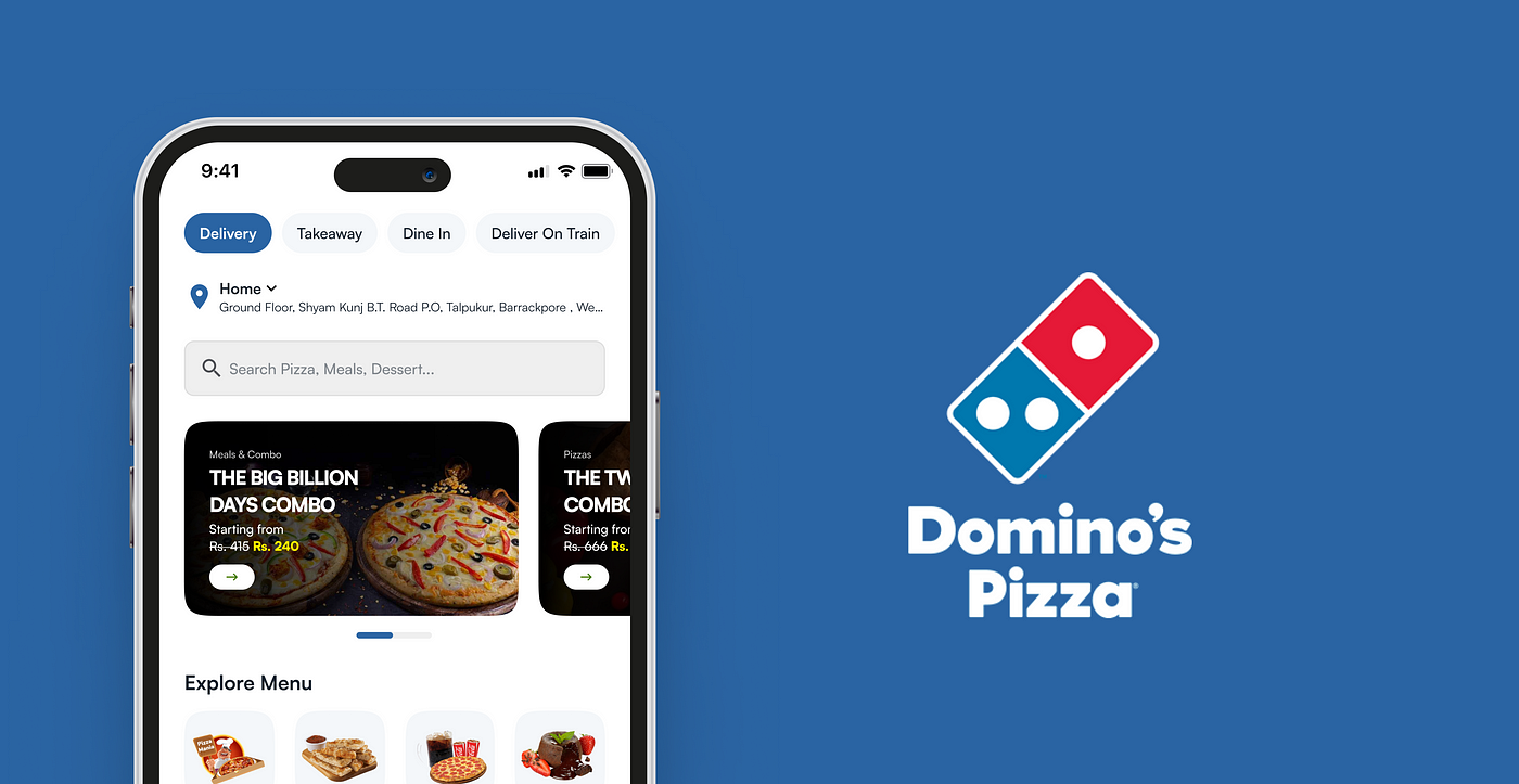
Domino’s Pizza – A Mobile Marketing Success Story
Domino’s Pizza stands as a stellar example of mobile marketing mastery in the fast-food industry. Their innovative approach to mobile e-commerce has not only revolutionized the way customers order pizza but also set a new standard for the food service sector.
A key aspect of Domino’s success is its user-friendly mobile app. The app simplifies the ordering process with features like easy customization of orders, real-time tracking, and a quick reordering system for favorite items. This convenience has significantly enhanced the customer experience, leading to increased sales and customer loyalty.
One of the most notable innovations by Domino’s was the introduction of ‘Zero Click Ordering.’ This feature allows customers to place an order simply by opening the app, with no additional clicks required, leveraging the power of simplicity and convenience in mobile commerce.
Domino’s also pioneered the use of quirky and engaging marketing techniques, such as ordering through a pizza emoji via text or social media. This not only garnered widespread media attention but also appealed to the tech-savvy, younger demographic.
Moreover, Domino’s has effectively utilized data analytics and customer feedback to continually improve its mobile app and services. This data-driven approach ensures that the app remains relevant and user-friendly, adapting to changing customer preferences and technological advancements.
Another aspect of Domino’s success is its integration with various devices and platforms. Customers can order through smartwatches, smart TVs, and voice-activated devices, showcasing Domino’s commitment to being at the forefront of technology and customer convenience.

From Domino’s, businesses can learn the importance of a customer-centric approach in mobile marketing. Their focus on convenience, innovative engagement strategies, and willingness to embrace new technologies serves as a blueprint for success in mobile e-commerce. Additionally, the ongoing optimization based on customer feedback and data analytics highlights the need for businesses to be adaptable and responsive to consumer needs and technological trends.
In summary, Domino’s Pizza exemplifies how creative mobile marketing strategies, coupled with a strong commitment to customer convenience and technological integration, can lead to remarkable success in the e-commerce domain.
Conclusion – Embracing Mobile Optimization in E-Commerce
As we’ve explored throughout this guide, optimizing for mobile is no longer an option but a necessity in the world of e-commerce. The shift towards mobile shopping is not just a trend but a fundamental change in consumer behavior. Businesses that embrace this change and prioritize mobile optimization are setting themselves up for success in a digital landscape that’s increasingly mobile-centric.
The key takeaways from this guide are clear: a mobile-first approach, responsive web design, streamlined user experience, speed optimization, secure and diverse payment options, and the strategic use of mobile apps and websites are all integral components of a successful mobile e-commerce strategy. Additionally, leveraging social media, implementing effective SEO for mobile, and continually analyzing and optimizing your strategy are essential for staying competitive and relevant.
Dominos Pizza’s success story underscores the importance of innovative mobile marketing and customer-centric approaches in driving sales and enhancing brand loyalty. Their example serves as inspiration for businesses looking to harness the power of mobile e-commerce.
In conclusion, the future of e-commerce is undeniably mobile. By adopting the strategies outlined in this guide, businesses can not only meet the evolving needs of the modern consumer but also unlock new opportunities for growth and engagement in the dynamic world of online shopping.