blog»ROI»Visualizing data for better decision making
Visualizing data for better decision making
2020/03/05
You can read this article in about 8 minutes
What is Data Visualization?
Data visualization is a graphical representation of data and information. To simply put it, Data visualization is a way of visualizing data using Graphs, Charts, Tables, Maps, etc. It is important to visualize data because data visualization provides an easy way to see and understand trends, patterns, and outliers in data.
We produced 2.5 quintillion bytes of data per day and by 2020, the collective total amount of big data around the world is expected to pass the 40 trillion gb mark. This means that data visualization is going to be more complex as we go. Therefore, easy to understand data visualization is crucial in making the move with the provided data.
How does data visualization help to make a better decision?
Simplicity:
Simplicity is beauty when it comes down to data visualization. Our eyes prefer to see things in a simple manner. Simplicity in data visualization boils down to two steps:
- Identifying the essential
- Eliminating the rest
With advances in technology, the types of information that are being collected by companies in their databases from their consumers are becoming complicated, in order to timely utilize those data’s, readability of those data should be simple.

When data is properly visualized patterns become obvious, those patterns, therefore, is what triggers in decision making. Here is an example of how simplicity in data:
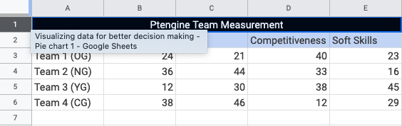
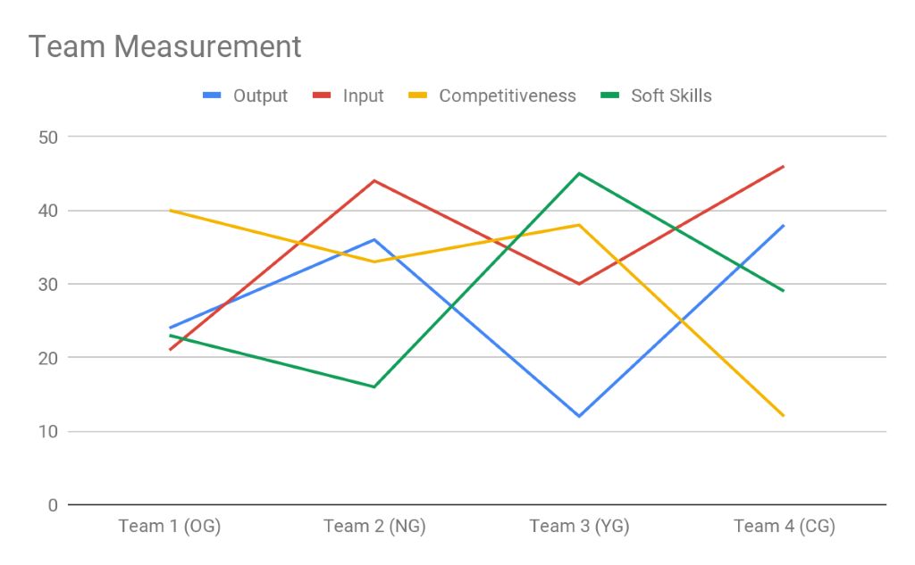
It’s the same table that is represented in the form of a graph. Now imagine you have an excel table filled with data like this:
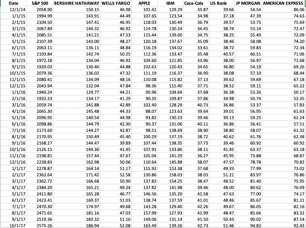
Reading through and analyzing data from this table can be daunting, but if you have the same data in the form of charts you can easily visualize the trends of the data that are listed in the table. For example, if you want to show a line graph of the S&P 500 with relation top 10 companies that Warren Buffet has invested in you can easily visualize and see the co-relation of Warren’s investment with the S&P 500 index.
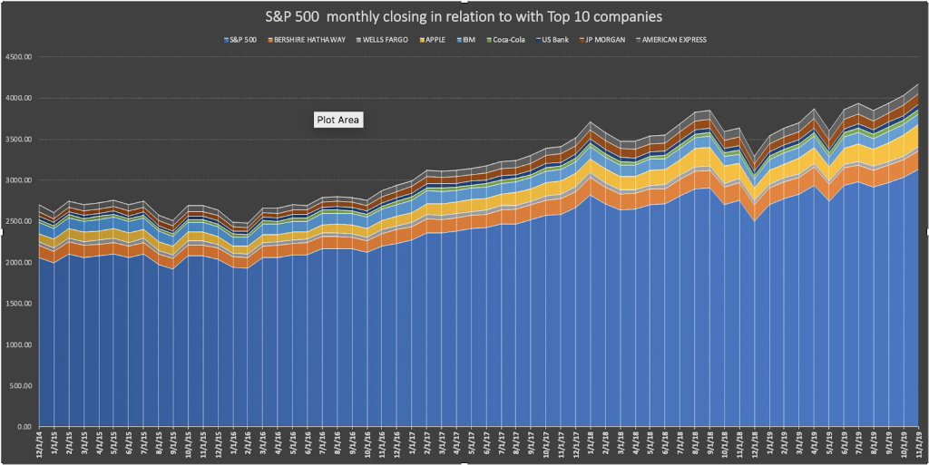
Data visualization makes your data simple and easy to understand. Data-visualization tools play an important part in democratizing data and analytics.
Collaboration is the next level:
Making data-driven insights available to workers throughout the organization empowers collaboration. With improved collaboration, your team can now focus on creating data-driven decisions that will benefit both the organization as well as the stakeholders. Imagine your team is sitting in a pile of raw data from google analytics about your company’s website, if you could turn that raw data into universally consumable form, by providing access to valuable information, you give people the tools to develop more informed opinions and empower them to contribute their perspective in the decision-making process.
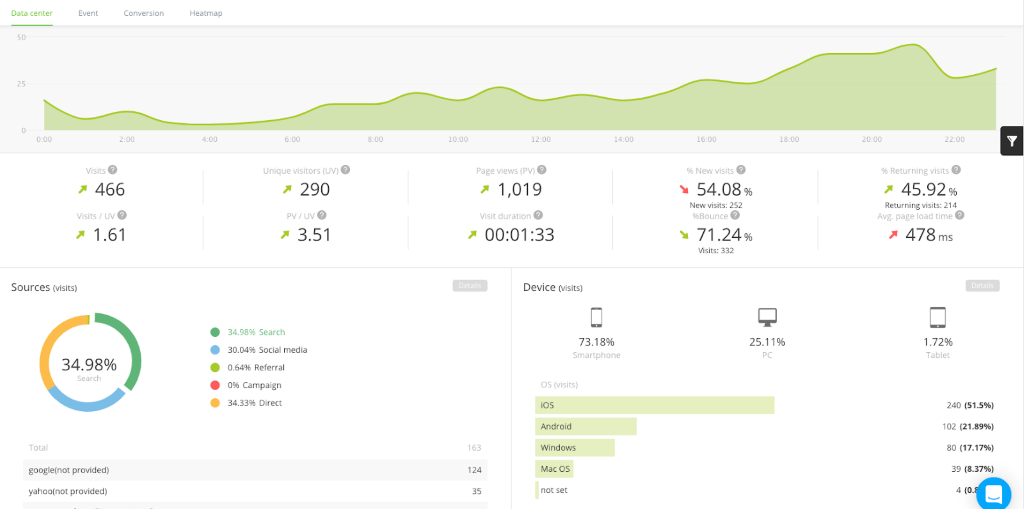
The above dashboard is easy to use the default dashboard inside Ptengine. If every one of your employees has access to see the dashboard now they can start analyzing data by themselves and creating high-impact decisions that affect the organization as a whole. If you look closely at the dashboard, everything is simple and easy to understand. With this sort of data visualization tool collaboration within the team becomes a norm.
It is crucial that diverse thought is being provoked when making decisions for the company as a whole. In fact, The Sloan School of Business surveyed 179 large publicly traded firms and found that those that used data to inform their decisions increased productivity and output by 5-6%. This included improvement in team collaboration to make an informed decision.
Improved Accuracy:
Achieving higher levels of accuracy requires methods that help developers better understand why some predictions fail while others succeed. Interactive visualization plays an important role in these tasks in the same way that it helps us to understand normal data in excel better. Turning data into clear and actionable information will result in improved accuracy. Organizations that are able to clearly turn their data into actionable information are the ones that are ahead in their industry.
Using tools like Ptengine can help you process data into dynamic visual representations that tells a story and effectively guide business decisions with predictive accuracy.
The top data sources that can impact your organization are varied, including insights gleaned from the following points:
- Social media
- Customer feedback
- Financial reports
- Human Resources information
- Website performance (Google Analytics)
You could track every detail of these metrics at every turn. Yet, they’re only helpful if you can understand them and act on what they’re telling you. That’s why so many businesses around the world are investing in top-tier data analytics software.